Advanced Image Color Inverter: 7 Ways to Transform Your Visuals Beyond Basic Inversion
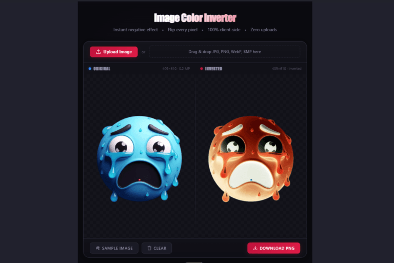
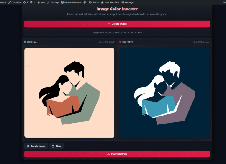
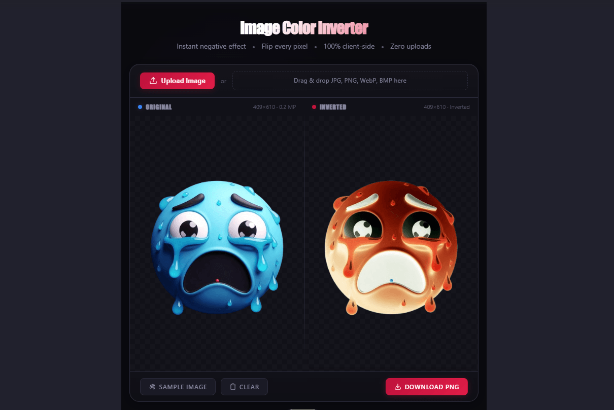
Color inversion is not a single‑effect gimmick — it’s a mathematical transformation that flips every pixel’s RGB value to its exact complement (R’=255‑R, G’=255‑G, B’=255‑B). But the Advanced Image Color Inverter goes further: it adds film negative correction, grayscale darkroom mode, glitch art posterization, and real‑time brightness/contrast controls. Here’s how to apply each of the 7 use cases with the new advanced features.
1. Accessibility‑First Dark Mode (Without Breaking Images)
Most dark‑mode extensions apply a blanket CSS filter: filter: invert(100%). That inverts everything — including photos — which turns portraits cyan and landscapes magenta. Not ideal.
The fix: Smart Invert (iOS) and Color Inversion (Android) are accessibility features that invert UI elements while leaving images and media untouched. On macOS, the shortcut Control + Option + Command + 8 toggles system‑wide inversion instantly.
When to invert the whole image instead: If you’re designing a dark‑mode version of a graphic from scratch, invert the original image, then adjust brightness/contrast manually. The tool‑based approach does exactly that — no system‑level override needed.
Advanced feature: Use the Brightness slider (-100 to +100) to fine‑tune the inverted result for optimal dark‑mode legibility. Lower brightness creates deeper blacks; higher brightness reveals shadow detail.
2. Negative‑Style Album Art & Thumbnails
The cyan‑shifted skin‑tone effect (red’s complementary color) reads as intentional “alternate universe” styling rather than a mistake. Use it for:
- Music album covers — the high‑contrast, slightly “wrong” color palette fits lo‑fi, synthwave, and experimental genres.
- YouTube thumbnails — inverted portraits stand out in a feed of warm‑toned faces.
- Discord server banners — pair an inverted image with the Vaporwave Text Generator for full‑width Unicode overlay.
Pro tip: Invert the original unedited photo, not one you already ran through a filter app — otherwise the filter’s color shift carries through to the negative.
Advanced feature: Toggle Posterize to reduce the color palette to 4 distinct bands per channel. This creates a high‑contrast, “glitch” aesthetic that’s perfect for album art and experimental thumbnails.
3. High‑Contrast Product Mockups
Inverting a product photo flips light and dark areas, which can reveal texture and shape details that blend into a busy background. This works especially well for:
- Engraving and laser cutting — inverting an image before processing dark materials (black stone, rubber, or layered acrylic) helps the engraver distinguish foreground from background.
- T‑shirt and merchandise mockups — a negative version of your design gives you a second colourway without re‑rendering the entire asset.
Advanced feature: Use the Grayscale (Darkroom Look) toggle before inversion. A grayscale negative removes color artifacts entirely, giving you a clean, high‑contrast black‑and‑white version that’s ideal for engraving and monochrome mockups.
4. Digital Negative Conversion (Film Scanning)
If you scan a physical film negative, the result is already inverted — you need to invert it again to get the positive image. The same RGB math applies: R’=255‑R, G’=255‑G, B’=255‑B.
Workflow: Scan the negative → open the Advanced Image Color Inverter → upload → download the positive. No Photoshop adjustment layers, no manual channel fiddling.
Caveat: This gives you a digital positive, not a colour‑corrected one. Real film negatives have an orange‑amber base tint that pure RGB inversion doesn’t remove.
Advanced feature: The Film Negative Mode checkbox subtracts approximately 40 from the red channel and 20 from the green channel before inversion — exactly the correction needed to neutralize the amber base tint of common film stocks (Kodak Gold, Portra, etc.). Enable this for a more accurate positive conversion.
5. Glitch‑Aesthetic & Surreal Digital Art
Color inversion is a core building block of the glitch aesthetic. Combine it with the advanced tool’s transformations:
| Workflow | Result |
|---|---|
| Invert → Posterize | High‑contrast, banded “broken screen” effect |
| Invert → Adjust Brightness → Invert back | Glowing, dream‑like halo around edges |
| Invert → Grayscale | Classic darkroom negative look |
All of these are processed client‑side — your source image never leaves your device.
Advanced feature: The Posterize toggle reduces each RGB channel to 4 distinct levels (0, 85, 170, 255). This creates the exact “low‑bit” glitch aesthetic seen in retro games and digital art. Combine with Contrast adjustments for even more dramatic banding.
6. Before/After Comparisons for Color Theory Lessons
The cyan‑shift on skin tones is a live demonstration of complementary colours. Use side‑by‑side comparisons to show:
- Red ↔ Cyan
- Green ↔ Magenta
- Blue ↔ Yellow
This works as a teaching aid for design students, social media captions, or portfolio case studies. The Advanced Image Color Inverter generates the inverted version instantly, so you can screenshot both and post the comparison without opening a desktop editor.
Advanced feature: The Brightness and Contrast sliders let you demonstrate how luminance adjustments affect colour perception — a key concept in colour theory that basic invert tools don’t support.
7. Testing Color Accessibility (Simulating Protanopia/Deuteranopia)
While full RGB inversion isn’t a colour‑blindness simulator, it does reveal which parts of your design rely solely on colour to convey meaning. If a red‑green distinction becomes unreadable after inversion, it’s a sign you need to add texture, labels, or patterns to make your design accessible.
Quick test: Invert your UI mockup. If critical buttons or status indicators become ambiguous, your colour contrast needs work — regardless of whether your users have typical colour vision.
Advanced feature: Toggle Grayscale before or after inversion to test two distinct accessibility scenarios:
- Grayscale before inversion — simulates how a user with total colour blindness sees your original design
- Grayscale after inversion — reveals which elements rely on colour and which rely on luminance contrast
Advanced Controls Reference
| Control | Function | Best For |
|---|---|---|
| Film Negative Mode | Subtracts amber tint before inversion (+40 R, +20 G) | Scanning physical film negatives |
| Grayscale | Converts to monochrome before inversion | Darkroom aesthetic, accessibility testing |
| Posterize | Reduces each channel to 4 levels | Glitch art, retro game aesthetic |
| Brightness | Adjusts luminance (-100 to +100) | Fine‑tuning contrast, dark‑mode optimization |
| Contrast | Adjusts contrast (-100 to +100) | Dramatic glitch effects, making text pop |
When to Use a Browser‑Based Inverter vs. Photoshop
| Task | Browser Tool | Photoshop |
|---|---|---|
| Single‑image inversion, no edits | ✅ Instant, no install | Overkill |
| Batch processing multiple images | ❌ Manual per image | ✅ Actions / Batch |
| Invert + adjust levels / curves | ✅ Brightness & Contrast included | ✅ Full control |
| Transparent PNG preservation | ✅ Alpha channel stays intact | ✅ Same |
| Film negative colour correction | ✅ Amber tint removal built‑in | ✅ Advanced curves |
| Quick social‑media asset | ✅ One click | ❌ Slower workflow |
Key Takeaway Checklist
| Check | Correct Answer |
|---|---|
| What’s the RGB inversion formula? | R’=255‑R, G’=255‑G, B’=255‑B |
| Does inverting an image give a real film negative? | No — real film has an amber base tint; pure RGB inversion is cooler |
| Which accessibility shortcut toggles inversion on macOS? | Control + Option + Command + 8 |
| Does the Advanced Image Color Inverter upload my image to a server? | No — all processing is client‑side in your browser |
| Want to keep transparency in a PNG? | Invert preserves alpha channels; only visible pixels change |
| What’s the complementary colour of red? | Cyan |
| Which advanced control removes amber tint from film scans? | Film Negative Mode (subtracts R+40, G+20 before inversion) |
| How do I create a glitch art effect? | Toggle Posterize — reduces each channel to 4 levels |
Written by Sharjeel — Lead Developer & Founder of Ghostern, software engineer who built the Advanced Image Color Inverter with the Film Negative, Grayscale, and Posterize features, and tested the RGB math on real portrait, product, and film‑scan photography before publishing this breakdown. Read my full story →
Disclaimer: Color theory explanations describe general RGB inversion behavior and typical human skin‑tone wavelength dominance — individual photo results vary based on lighting, original colour grading, and camera sensor characteristics. Film Negative Mode approximates the amber tint removal for common film stocks (Kodak Gold, Portra) but may not perfectly match all film types.
❓ Frequently Asked Questions About Advanced Image Color Inversion
What is the RGB inversion formula?
The exact mathematical formula is R’=255‑R, G’=255‑G, B’=255‑B. Every pixel’s red, green, and blue channel values are subtracted from 255, producing the exact complementary color. This is the same math used by Photoshop, GIMP, and all professional image editors.
What does Film Negative Mode do?
Film Negative Mode subtracts approximately 40 from the red channel and 20 from the green channel before inversion. This removes the orange‑amber base tint that is characteristic of common film stocks like Kodak Gold and Portra. The result is a more accurate positive conversion from a scanned film negative.
What is the Posterize effect and when should I use it?
Posterize reduces each RGB channel to 4 distinct levels (0, 85, 170, 255). This creates a high‑contrast, “banded” effect that looks like a glitch or retro game aesthetic. Use it for album art, thumbnails, and experimental digital art where you want a stylized, low‑bit look.
How does the Grayscale mode work?
Grayscale mode converts the image to monochrome before inversion. The result is a classic black‑and‑white darkroom negative look — no colour artifacts, just pure tonal inversion. Use it for accessibility testing, darkroom aesthetic, or when you want a clean, colour‑free negative effect.
Can I adjust brightness and contrast after inversion?
Yes. The Advanced Image Color Inverter includes Brightness (-100 to +100) and Contrast (-100 to +100) sliders that adjust the image after inversion is applied. This lets you fine‑tune your result in real time without re‑uploading.
Does the tool upload my image to a server?
No — all processing happens client‑side in your browser. Your image never leaves your device. This is why the tool is instant (no upload wait) and completely private. No data collection, no server storage, no watermarks.
Does inverting affect transparent PNG areas?
No — transparency is preserved. The inversion only affects visible pixels; alpha channels (transparent areas) stay transparent. This is useful for overlays, logos, and composite designs where you want the negative effect on the subject but not on the background.
What accessibility shortcut toggles inversion on macOS?
Control + Option + Command + 8 toggles system‑wide inversion instantly. On iOS, Smart Invert inverts UI elements while leaving images and media untouched. On Android, Color Inversion is available in accessibility settings.
What’s the complementary color of red?
Cyan. This is why red‑heavy skin tones turn cyan when inverted — red and cyan are exact complements on the color wheel. The same principle applies to green ↔ magenta and blue ↔ yellow.
When should I use a browser‑based inverter instead of Photoshop?
Use the browser tool for single‑image workflows: quick social assets, thumbnails, film negative conversions, and glitch art experiments. Use Photoshop for batch processing, complex layer work, or when you need pixel‑perfect control over individual channels.
![A high-contrast video thumbnail for a 'Clan Tag Generator' tool, set against a futuristic, dark tech background. The text '[YOUR TAG HERE]' is prominently displayed in a sleek, glowing blue box, with a large orange arrow pointing to a box on the right listing example tags like '[GRUNT]', '[SNIPE]', and '[VIP]'. A small 'FREE!' badge is in the top-left corner, and a button below the examples reads 'INSTANT GENERATION'.](https://ghostern.com/wp-content/uploads/2026/07/Clan-Tag-Generator-Create-Unique-Tags-Instantly-768x429.png)