Aesthetic wallpaper color theory reveals how colors, light, and texture combine to create viral designs. Master the formula for visually stunning wallpapers.
By sharjeel | 2025-11-22
Table of Contents
The Color Alchemist
Maya stared at her screen, mesmerized by a wallpaper that seemed to pulse with life. The aesthetic wallpaper color theory behind it was invisible but undeniable—colors flowed into one another like water, light caught the edges just right, and texture gave it a tactile quality that made her fingers itch to touch. She wondered what made this particular image so captivating while others fell flat. As someone who had changed her phone background weekly for years, she was beginning to sense there was a formula, a kind of visual alchemy that turned ordinary images into extraordinary experiences. This wasn’t just about pretty colors; it was about how those colors worked together, how light played across surfaces, and how texture created depth and dimension.
TL;DR
Master aesthetic wallpaper color theory by understanding how colors, light, and texture combine to create emotionally resonant wallpapers that capture attention and feel alive.
Understanding Aesthetic Wallpaper Color Theory
Aesthetic wallpaper color theory isn’t just about picking colors that look good together—it’s about creating visual harmony that evokes emotion and tells a story. When we look at a wallpaper that resonates with us, we’re responding to a carefully crafted combination of elements that work together to create a specific mood or feeling.
At its core, color theory in wallpaper design rests on three fundamental pillars:
- Color relationships: How colors interact with and complement each other
- Light dynamics: How light and shadow create depth and dimension
- Textural elements: How visual texture creates tactile sensation and interest
These elements don’t exist in isolation. They work together like instruments in an orchestra, each playing its part to create a symphony of visual experience. The most successful wallpapers—those that go viral and stand the test of time—master this interplay, creating images that feel both intentional and effortless.
The difference between a good wallpaper and a great one often comes down to this understanding. Anyone can pick colors they like, but knowing how those colors will interact, how light will affect them, and how texture will enhance them elevates a design from merely decorative to truly captivating.
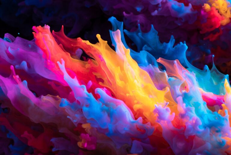
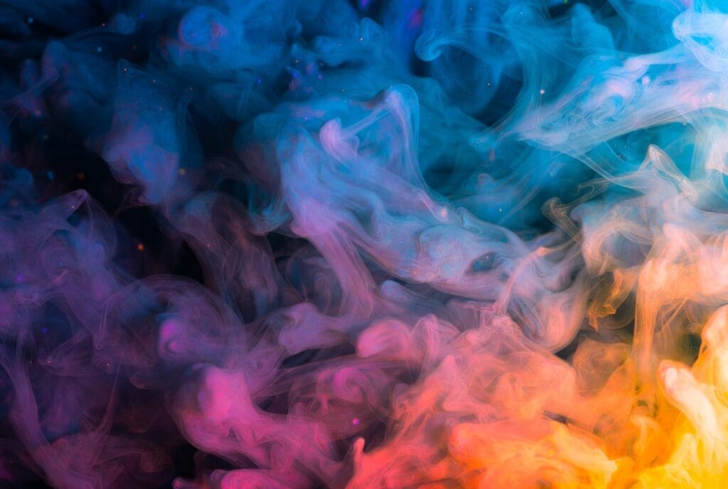
 — Caption: This aesthetic wallpaper color theory example shows how harmonious color relationships create visual impact.
The Psychology of Color in Wallpaper Design
Colors speak to us on a primal level, triggering emotional responses that we often can’t articulate but feel deeply. When we select wallpapers for our devices, we’re making choices that reflect our personalities, moods, and aspirations—even if we’re not consciously aware of it.
Color psychology plays a crucial role in wallpaper design:
- Blues and greens tend to evoke feelings of calm, tranquility, and connection to nature
- Warm reds and oranges create energy, passion, and warmth
- Purples and pinks often suggest creativity, luxury, and imagination
- Neutrals like grays and beiges provide sophistication, stability, and versatility
- Yellows bring optimism, energy, and happiness
The intensity of these colors matters just as much as the hues themselves. Soft, muted versions of typically energetic colors like red or orange can create warmth without agitation, while bright, saturated versions of typically calming colors like blue can feel energizing rather than relaxing.
Cultural associations also influence how we perceive colors. While some color meanings are nearly universal (red often signifies passion or danger across many cultures), others vary significantly. A wallpaper designer working for a global audience needs to consider these differences to create images that resonate across cultural boundaries.
Personal associations add another layer of complexity. Our individual experiences with colors—shaped by memories, preferences, and life experiences—mean that the same wallpaper can evoke different responses in different people. This is why having a diverse range of color palettes available is so important in wallpaper design.
Light and Shadow: Creating Depth and Dimension
Light is what gives color its life, and understanding how to manipulate light and shadow is essential to creating wallpapers that feel dynamic and three-dimensional. Even on a flat screen, the illusion of depth can transform a wallpaper from a simple image to an immersive experience.
Light direction creates mood and focus:
- Front lighting flattens images but reveals true color
- Side lighting emphasizes texture and creates drama
- Back lighting creates silhouettes and mystery
- Top lighting mimics natural sunlight and feels familiar
- Bottom lighting feels unnatural and can create tension
Light quality affects emotional response:
- Hard light creates sharp shadows and high contrast, feeling dramatic and intense
- Soft light produces gentle shadows and gradual transitions, feeling calm and dreamy
- Diffused light minimizes shadows, creating an ethereal, otherworldly quality
Color temperature of light changes how we perceive the colors in a wallpaper:
- Warm light (yellow/orange tint) enhances reds, oranges, and yellows while muting blues
- Cool light (blue tint) enhances blues, greens, and purples while muting warm colors
- Neutral light preserves the true colors of the image
The most successful wallpapers use light intentionally to guide the viewer’s eye, create focal points, and establish mood. A wallpaper with dramatic side lighting might feel mysterious and intense, while one with soft, diffused lighting might feel peaceful and dreamy. Neither is inherently better—they simply create different emotional experiences.
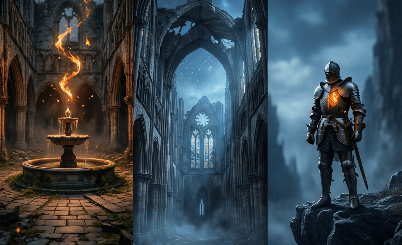
 — Caption: Light and shadow work together in this aesthetic wallpaper color theory example to create depth and dimension.
Texture: The Tactile Element of Visual Design
Texture adds a tactile quality to wallpapers that makes them feel more tangible and engaging. Even though we can’t physically touch our screens, our brains respond to visual texture as if we could, creating a richer, more immersive experience.
Types of texture in wallpaper design include:
- Natural textures like wood grain, stone, water, or fabric that connect us to the physical world
- Abstract textures like gradients, noise, or patterns that create visual interest without representing specific objects
- Implied textures that suggest how a surface might feel if touched, even when it’s clearly digital
Texture density affects how a wallpaper feels:
- High-density textures with lots of detail create energy and can feel more organic
- Low-density textures with minimal detail feel cleaner and more modern
- Varied density creates visual rhythm and guides the eye through the image
Texture interaction with light is crucial:
- Rough textures scatter light in multiple directions, creating soft highlights and shadows
- Smooth textures reflect light more directly, creating sharper highlights and cleaner shadows
- Mixed textures create complex interplay between light and surface, adding visual interest
The most effective wallpapers use texture to enhance the emotional impact of the image without overwhelming it. A subtle paper texture can make a digital illustration feel more handmade and personal, while a dramatic stone texture can add weight and permanence to an architectural image. The key is finding the right balance—enough texture to create interest and depth, but not so much that it distracts from the overall composition.
The Perfect Color Palette
Harmonious Color Schemes
Creating a harmonious color palette is both an art and a science. While there are established color relationships that generally work well together, the perfect palette also depends on the emotional response you want to evoke and the story you want to tell.
Classic color harmonies include:
- Monochromatic: Variations in lightness and saturation of a single hue
- Analogous: Colors adjacent to each other on the color wheel
- Complementary: Colors opposite each other on the color wheel
- Split-complementary: A base color with the two colors adjacent to its complement
- Triadic: Three colors evenly spaced around the color wheel
- Tetradic: Four colors arranged into two complementary pairs
Modern approaches to color harmony often break these traditional rules, focusing instead on:
- Muted palettes with desaturated colors that feel sophisticated and calming
- Accent colors that pop against primarily neutral backgrounds
- Gradient transitions that create movement between colors rather than hard boundaries
- Unexpected combinations that create tension and visual interest
When creating a color palette for a wallpaper, consider not just how the colors work together in theory, but how they’ll appear on different screens and in different lighting conditions. Colors that look harmonious on a calibrated monitor might look quite different on a phone screen in bright sunlight.
Contrast for Impact
Contrast is what makes wallpapers visually dynamic and engaging. It creates hierarchy, guides the eye, and ensures that important elements stand out. Without contrast, even the most carefully chosen colors can feel flat and uninteresting.
Types of contrast in wallpaper design include:
- Value contrast: Differences between light and dark areas
- Hue contrast: Differences between colors themselves
- Saturation contrast: Differences between intense and muted colors
- Temperature contrast: Differences between warm and cool colors
- Texture contrast: Differences between smooth and textured areas
Strategic use of contrast involves:
- Creating focal points through areas of high contrast
- Establishing visual hierarchy by varying contrast levels
- Guiding the eye through the image using contrast transitions
- Balancing rest and excitement with areas of both high and low contrast
The most effective wallpapers use contrast intentionally to create visual interest without overwhelming the viewer. High contrast can create drama and energy, while low contrast can feel calm and sophisticated. The key is finding the right balance for the mood you want to create.
For practical color palette creation, tools like Adobe Color can help you experiment with different harmonies and see how they work together. The platform allows you to explore color relationships and save palettes for future use, making it easier to develop a consistent color language across your wallpaper designs.
 — Caption: This balanced color palette demonstrates key aesthetic wallpaper color theory principles in action.
Balancing Elements for Viral Appeal
Creating a wallpaper that resonates widely enough to go viral requires balancing multiple elements in a way that feels both fresh and familiar. The most shared wallpapers often hit a sweet spot between innovation and accessibility.
Key balance points include:
- Complexity vs. simplicity: Enough detail to be interesting but not so much that it feels cluttered
- Uniqueness vs. familiarity: Fresh enough to stand out but relatable enough to connect emotionally
- Emotional intensity vs. versatility: Strong enough mood to be memorable but neutral enough for everyday use
- Artistic vision vs. technical constraints: Creative expression that works within the limitations of digital displays
Trending elements that often appear in viral wallpapers include:
- Gradient transitions that create movement and depth
- Minimal compositions with strategic use of negative space
- Nature-inspired elements that connect viewers to the natural world
- Abstract forms that allow for personal interpretation
- Retro aesthetics updated with modern techniques
Platform considerations also affect viral potential:
- Mobile optimization is essential as most wallpaper viewing happens on phones
- Social media cropping must be considered for images that will be shared
- Thumbnail appeal determines whether users will click to see the full image
- File size and format affect loading times and compatibility
Understanding these balance points doesn’t mean creating formulaic wallpapers—it means making intentional choices about where to push boundaries and where to follow established patterns that resonate with viewers.
Technical Considerations for Color Accuracy
Creating wallpapers that look their best across different devices requires attention to technical details that can significantly affect how colors appear.
Color spaces determine which colors can be displayed:
- sRGB is the standard color space for the web and most mobile devices
- P3 is a wider color space used by newer iPhones and some Android devices
- Adobe RGB is even wider but less commonly supported on mobile devices
Color profiles ensure consistency across devices:
- Embedded profiles tell devices how to interpret the colors in an image
- Profile conversion may be necessary when moving between different color spaces
- Profile mismatches can cause colors to appear drastically different than intended
Display technologies affect color reproduction:
- OLED screens display deeper blacks and more vibrant colors than LCDs
- LCD screens may appear less saturated but more consistent across viewing angles
- Screen coatings can affect how colors appear in different lighting conditions
File formats impact color accuracy:
- PNG preserves color accuracy but creates larger files
- JPEG offers better compression but can introduce color shifts
- WebP provides excellent compression with good color preservation
For the most accurate color representation, consider creating multiple versions of your wallpapers optimized for different display types and color spaces. While this requires more work, it ensures that your carefully crafted color palettes look their best regardless of how or where they’re viewed.
Creating Your Own Aesthetic Wallpaper
Applying aesthetic wallpaper color theory to your own creations doesn’t require professional design software or extensive training. With some basic tools and an understanding of the principles we’ve discussed, you can create wallpapers that are both beautiful and emotionally resonant.
Getting started requires just a few tools:
- Image editing software like Photoshop, GIMP, or even mobile apps like Snapseed
- Color palette tools like Adobe Color or Coolors to develop harmonious color schemes
- Inspiration sources like Pinterest, art museums, or nature photography
Step-by-step process for creating a wallpaper:
- Define your mood—What feeling do you want your wallpaper to evoke?
- Select your base colors using color theory principles
- Establish your light source to create depth and dimension
- Add texture elements to enhance tactile sensation
- Create contrast to establish visual hierarchy
- Test on different devices to ensure consistency
- Refine and adjust based on how the wallpaper appears in actual use
Common pitfalls to avoid:
- Over-saturation that makes colors look unnatural
- Insufficient contrast that makes elements blend together
- Ignoring safe zones where UI elements will appear
- Neglecting to test on different screen types and sizes
Remember that creating great wallpapers is a skill that improves with practice. Don’t be discouraged if your first attempts don’t turn out exactly as planned. Each wallpaper you create is an opportunity to refine your understanding of how colors, light, and texture work together to create emotional impact.
For color inspiration and trend forecasting, Pantone’s seasonal color reports offer valuable insights into emerging color trends that can help keep your wallpaper designs feeling fresh and current.
Technical Specifications
| Setting | Recommendation |
|---|---|
| Resolution | Multiple versions: 1080×1920, 1440×2560, 2160×3840 |
| Color Space | sRGB for universal compatibility, P3 for newer devices |
| File Format | JPEG for photos, PNG for graphics, WebP for optimal compression |
| Compression | 80-90% quality for JPEG, lossless for PNG/WebP when possible |
| Aspect Ratio | 9:19.5 for modern phones, 9:16 for older devices |
| Color Depth | 24-bit (16.7 million colors) minimum |
Frequently Asked Questions
How many colors should I use in a wallpaper?
There’s no magic number, but most effective wallpapers use 3-5 main colors plus their variations. Limited color palettes tend to feel more cohesive and intentional, while too many colors can create visual chaos. Focus on creating a primary color, secondary colors, and accent colors that work together harmoniously.
What’s the difference between RGB and CMYK color modes for wallpapers?
RGB (Red, Green, Blue) is used for digital displays like phones and computers, while CMYK (Cyan, Magenta, Yellow, Key/Black) is used for print. Since wallpapers are viewed exclusively on digital screens, you should always work in RGB color mode to ensure colors display accurately.
How can I make sure my wallpaper looks good on both OLED and LCD screens?
OLED screens display deeper blacks and more vibrant colors than LCD screens. To ensure your wallpaper looks good on both, avoid relying on extreme brightness or saturation differences. Test your wallpaper on both types of screens if possible, and aim for a balanced look that doesn’t depend on the unique characteristics of either display technology.
Why do my wallpapers look different when I upload them to social media?
Social media platforms often compress images and apply color filters that can alter how your wallpapers appear. To minimize these changes, export your wallpapers at high quality with appropriate color profiles embedded. Some platforms also have specific color space requirements that can affect how your images are displayed.
Can I use copyrighted images as inspiration for my wallpapers?
While you can use copyrighted images for personal inspiration and learning, you should not directly copy or reproduce them in wallpapers you plan to share publicly. Instead, use them as references to understand color relationships, composition techniques, and lighting approaches that you can then apply to your original creations.
Why This Matters
Understanding aesthetic wallpaper color theory isn’t just about creating pretty backgrounds for our devices—it’s about crafting intentional visual experiences that enhance our daily interactions with technology. In a world where we spend countless hours looking at screens, the images we choose to surround ourselves with have a real impact on our mood, productivity, and overall wellbeing. When we apply thoughtful color theory to wallpaper design, we’re not just decorating our devices—we’re creating moments of beauty, calm, or inspiration that can transform ordinary digital interactions into something more meaningful. This knowledge empowers us to move beyond passive consumption of digital content to become active creators of our digital environments.
Ready to explore more aesthetic wallpaper inspiration? Check out our aesthetic wallpaper collection for examples that showcase beautiful color relationships, or visit our guide on wallpaper sizes for different devices to ensure your creations look perfect on any screen.
For deeper color exploration, Adobe Color offers an excellent platform for experimenting with color palettes and understanding how different hues work together. You can explore their tools at color.adobe.com. For trend forecasting and color inspiration, Pantone’s seasonal color reports provide valuable insights into emerging color trends that can keep your wallpaper designs feeling fresh and current.
About the Author
Sharjeel is a digital artist and color theory enthusiast with a passion for creating visually stunning wallpapers that transform digital spaces. With years of experience in digital design and a deep understanding of color psychology, they specialize in helping others craft intentional visual experiences for their devices. Follow their latest color palettes and design inspiration on Pinterest @sharjeelcolors.

