Dark fantasy wallpaper design tips that transform your screen. Learn how color temperature, contrast, and composition create mood in your favorite wallpapers.
By sharjeel | 2025-11-19
Table of Contents
The Smith’s Parable
In a realm beyond sight, an ancient smith worked tirelessly at his forge. With each strike of his hammer, he didn’t just shape metal—he crafted light and shadow into armor that told stories. He understood that the strongest armor wasn’t made from the purest steel alone, but from the perfect balance of illumination and darkness. When his creations were worn in battle, they seemed to absorb the very essence of the conflict around them, reflecting not just physical blows but the emotional weight of the wearer. This smith knew what many artists forget: that the interplay of light and shadow, color and contrast, creates not just images, but experiences.
TL;DR
Master dark fantasy wallpaper design by understanding how color temperature, contrast, and focal points work together to create mood and visual impact.
Understanding Dark Fantasy Wallpaper Design
Dark fantasy wallpaper design tips begin with recognizing that these images are more than just decorations—they’re windows into atmospheric worlds that evoke emotion and set the tone for your digital space. When you look at a well-crafted dark fantasy wallpaper, you’re not just seeing a picture; you’re experiencing a carefully constructed visual narrative that draws you in and holds your attention.
The magic happens when three key elements—color, contrast, and composition—work in harmony. Like the smith’s armor, the strongest wallpapers balance light and shadow to create depth, use color temperature to establish mood, and guide your eye to focal points that tell the story. This is why some wallpapers feel stronger while others fall flat, even when they feature similar subject matter.
The Power of Color Temperature
Color temperature is the invisible hand that shapes the emotional response to your wallpaper. In dark fantasy design, temperature isn’t just about warm versus cool—it’s about creating a visual language that speaks directly to the viewer’s subconscious.
Warm colors (reds, oranges, yellows) tend to advance in a composition, creating intimacy and intensity. They’re perfect for scenes of battle, fire, or magical energy. Cool colors (blues, greens, purples) recede, establishing distance, mystery, and sometimes menace. The most effective dark fantasy wallpapers often play with this tension, placing warm focal points against cool backgrounds to create immediate visual interest.
Consider these temperature relationships:
- Fire against night: The warm glow of flames against cool darkness creates natural contrast
- Magic in shadows: Bright magical elements stand out when surrounded by cooler environmental tones
- Character lighting: A character’s face illuminated by warm light against a cool background immediately draws attention
When selecting or creating dark fantasy wallpapers, pay attention to how color temperature guides your eye through the image. The strongest compositions use temperature as a roadmap, leading viewers to the most important elements without obvious arrows or pointers.
Mastering Contrast for Impact
Contrast is the hammer that shapes your visual experience. In dark fantasy wallpaper design, contrast does more than make elements visible—it creates hierarchy, establishes mood, and adds drama to otherwise flat compositions.
There are several types of contrast to consider:
- Value contrast: The difference between light and dark areas
- Color contrast: The relationship between different hues
- Saturation contrast: The variation between intense and muted colors
- Texture contrast: The interplay between detailed and smooth areas
The most compelling dark fantasy wallpapers often use value contrast as their foundation. Deep shadows next to bright highlights create depth and dimension that make images feel three-dimensional. This is particularly effective in scenes featuring armor, architecture, or dramatic lighting.
When adjusting contrast, remember that subtlety often works better than extremes. Too much contrast can create a harsh, posterized look that loses the nuanced details that make dark fantasy art so compelling. The goal is to enhance the natural contrast of the scene, not to create artificial extremes.
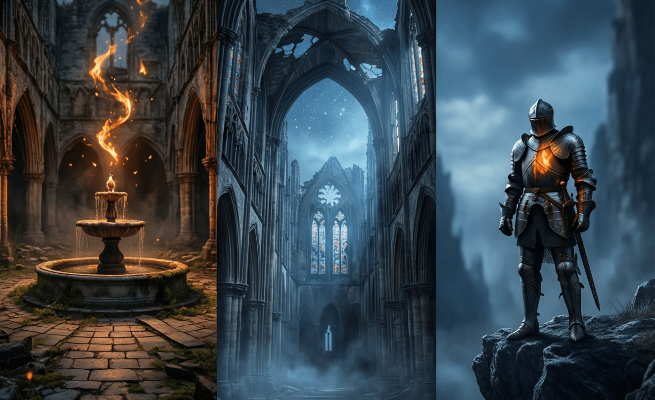
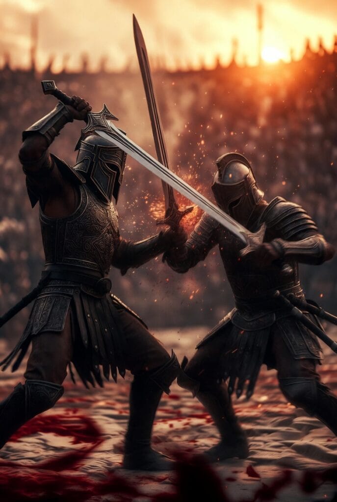
 — Caption: Strategic contrast placement creates focal points that guide the viewer’s eye through this atmospheric scene.
Creating Compelling Focal Points
Every great dark fantasy wallpaper has at least one focal point—a specific area that draws the viewer’s attention and serves as the visual anchor for the entire composition. Without these focal points, wallpapers become visual noise that fails to engage or hold interest.
Focal points can be created through several techniques:
- Isolation: Placing an important element against a simpler background
- Convergence: Using lines or shapes that lead to a specific point
- Size difference: Making the focal element larger than surrounding elements
- Color emphasis: Using a unique color for the focal point
- Sharpness contrast: Keeping the focal point sharp while softening surrounding areas
In dark fantasy art, focal points often represent key narrative elements—a character’s face, a magical artifact, a dramatic architectural feature, or a moment of action. These elements should be positioned according to the rule of thirds or other compositional guidelines to create a balanced, pleasing arrangement.
When selecting wallpapers for your devices, consider how the focal points interact with your interface elements. A wallpaper with a strong central focal point might work beautifully as a lock screen but could interfere with icons on a home screen.
Practical Editing Techniques
Curves Adjustments
Curves adjustments are perhaps the most powerful tool in your dark fantasy wallpaper enhancement toolkit. Unlike simple brightness or contrast sliders, curves give you precise control over the entire tonal range of an image.
Here’s how to use curves effectively:
- Create a gentle S-curve to add overall contrast and impact
- Lift the shadows slightly to preserve detail in darker areas
- Pull back the highlights to prevent blown-out bright areas
- Target specific ranges to enhance particular elements
For dark fantasy wallpapers, focus on preserving shadow detail while maintaining the moody atmosphere. A common mistake is crushing the blacks completely, which loses texture and depth. Instead, aim for rich, detailed shadows that still feel dark and mysterious.
Split-Toning for Mood
Split-toning allows you to add different colors to the highlights and shadows of your image, creating a unified color palette that enhances the mood. This technique is particularly effective for dark fantasy wallpapers, where color plays such an important role in establishing atmosphere.
To apply split-toning:
- Choose complementary colors for highlights and shadows (e.g., blue shadows with amber highlights)
- Keep saturation subtle—a little goes a long way
- Balance the effect so it enhances rather than overwhelms the image
- Consider the emotional impact of your color choices
For a classic dark fantasy look, try cool shadows (blues or cyans) with warm highlights (ambers or reds). This creates a naturalistic yet dramatic color scheme that works well for scenes with fire, magic, or dramatic lighting.
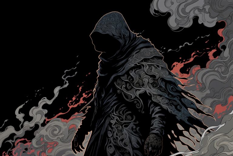
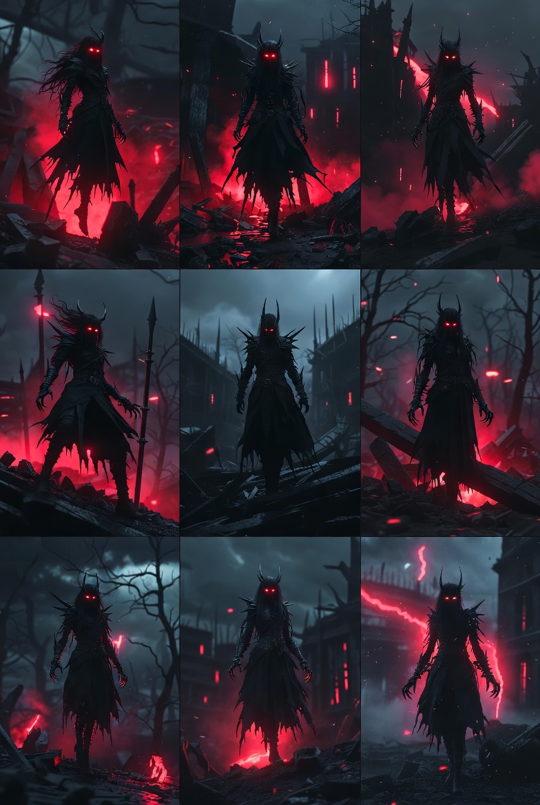
 — Caption: Annotations reveal how focal points and compositional elements guide the viewer through this dark fantasy scene.
Optimizing for Different Screens
Phone Home Screen Crops
Phone home screens present unique challenges for dark fantasy wallpapers due to the presence of icons, widgets, and other interface elements. The right crop can make the difference between a wallpaper that enhances your device and one that fights with it.
For optimal home screen crops:
- Place important elements away from the center where icons typically appear
- Use the rule of thirds to position focal points in the left or right third of the image
- Consider vertical orientation for better use of phone screen real estate
- Leave space at the top for status bars and notifications
For iPhone lock-screen layouts, pay special attention to the time and date display areas, ensuring that important visual elements aren’t obscured by these persistent UI elements.
Lock Screen Considerations
Lock screens offer more freedom for creative composition since they typically have fewer persistent interface elements. This makes them ideal for showcasing the full impact of dark fantasy wallpapers.
When selecting or creating wallpapers for lock screens:
- Center important elements for maximum impact when the device wakes
- Consider the unlock animation and how it interacts with your image
- Use the full height of the screen for dramatic vertical compositions
- Test with notifications to ensure they don’t completely obscure key elements
For devices with always-on displays, consider how the wallpaper looks at reduced brightness and with minimal UI elements. The best lock screen wallpapers maintain their impact even in these low-power states.
Technical Specifications
| Setting | Recommendation |
|---|---|
| Resolution | Match device native resolution (e.g., 1170 x 2532 for iPhone 13 Pro) |
| Color Space | sRGB for compatibility, Adobe RGB for wide-gamut displays |
| File Format | PNG for limited color palettes, JPEG for complex images |
| Compression | 80-90% quality for JPEG, lossless for PNG when possible |
| Aspect Ratio | Device-specific (19.5:9 for modern phones, 16:9 for desktops) |
| Color Depth | 24-bit (16.7 million colors) minimum |
Related Ideas
- Creating Moody Atmospheres in Fantasy Art
- Color Theory for Digital Artists
- Composition Techniques for Wallpaper Design
- The Psychology of Color in Gaming
- Advanced Editing for Dark Fantasy Photography
- Mobile Wallpaper Optimization Guide
Frequently Asked Questions
Why do some dark fantasy wallpapers look better than others even with similar subjects?
The difference usually comes down to intentional design choices like color temperature, contrast levels, and focal point placement. Wallpapers that feel stronger typically have a clear visual hierarchy and use color and contrast to guide the viewer’s eye to important elements.
How can I make my own dark fantasy wallpapers more impactful?
Focus on creating a clear focal point, using color temperature to establish mood, and applying contrast strategically to add depth. Simple curves adjustments and subtle split-toning can dramatically improve the impact of your images without requiring advanced editing skills.
What’s the best way to crop dark fantasy wallpapers for phone screens?
For home screens, place important elements away from the center where icons appear. Use the rule of thirds to position focal points in the left or right third of the image. For lock screens, you can center important elements since there are typically fewer persistent interface elements.
How does color temperature affect the mood of dark fantasy wallpapers?
Color temperature directly influences emotional response—warm colors (reds, oranges) create intensity and intimacy, while cool colors (blues, greens) establish distance and mystery. The most effective wallpapers often play with this tension, placing warm focal points against cool backgrounds.
Can I improve existing dark fantasy wallpapers with basic editing tools?
Absolutely! Simple adjustments like curves to enhance contrast, subtle split-toning to unify the color palette, and careful cropping to improve composition can dramatically improve even mediocre wallpapers. You don’t need advanced software to make meaningful improvements.
Why This Matters
Understanding the principles of dark fantasy wallpaper design transforms how you experience your digital spaces. When you apply these design tips, your devices become more than just tools—they become windows into atmospheric worlds that reflect your aesthetic sensibilities and enhance your daily interactions with technology. The same principles that make a great wallpaper also apply to visual communication in general, making this knowledge valuable beyond just personalizing your screens.
Ready to transform your digital spaces? Explore our Dark Souls wallpaper collection for professionally designed examples that master these principles, or check out our Dark Souls wallpaper mood guide for more specialized techniques.
For deeper insights into color theory and composition, the Interaction Design Foundation’s guide on color in design offers an excellent foundation that applies directly to wallpaper creation.
About the Author
Sharjeel is a digital artist and designer specializing in atmospheric visual experiences. With a background in both traditional art and digital design, they bring a unique perspective to creating and curating wallpapers that transform digital spaces. Follow their latest projects and inspiration on Instagram @sharjeelcreates.