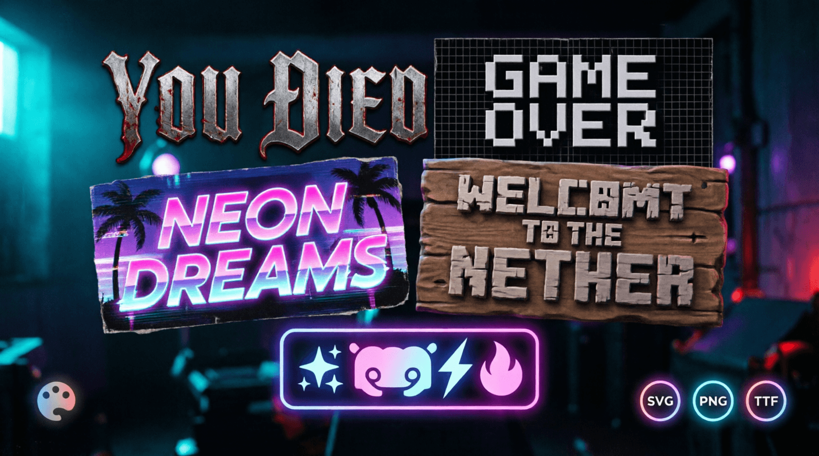
Best Fonts for Gaming YouTube Thumbnails — What Top Streamers Actually Use
YouTube thumbnails have exactly 2 seconds to earn a click. Font choice determines whether that click happens. This guide breaks down which fonts top gaming creators actually use, why they work, and exactly how to recreate them — no design degree required.
Table of Contents
Why Thumbnail Fonts Matter (The Data)
YouTube analytics consistently show that thumbnails with high-contrast, bold text outperform those with generic fonts by 25-30% in click-through rate. The reason is cognitive: the human brain processes bold, simple shapes faster than complex ones.
Critical numbers:
- Average thumbnail gets 1-2 seconds of viewer attention
- Font must be readable at 120px wide (mobile preview)
- Use maximum 2 font weights per thumbnail
- White text with black outline is the most universally readable combo
The Top Gaming Font Styles (And When to Use Them)
| Font Style | Best For | Color Palette | Tool |
|---|---|---|---|
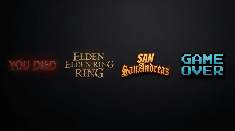
| Gothic/Blackletter | Horror games, Souls-like, dark fantasy | White with red glow | Dark Souls Font Generator |
| Gold Serif | Epic games, RPGs, boss fights | Gold with dark background | Elden Ring Font Generator |
| Blocky Sans-Serif | Action games, FPS, modern branding | White with black outline or color accent | GTA Font Generator |
| Pixel/Retro | Indie games, platformers, retro aesthetic | Bright colors with pixel edges | Pixel Art Font Generator |
Font Strategy by Game Genre
1. Horror & Souls-Like Games
- Font: Gothic, distressed, serif with irregular edges
- Color: White, red, or pale gold
- Effect: Red glow, subtle shadow
- Text style: ALL CAPS, slightly spread
- Example: “YOU DIED” — iconic, instantly recognisable
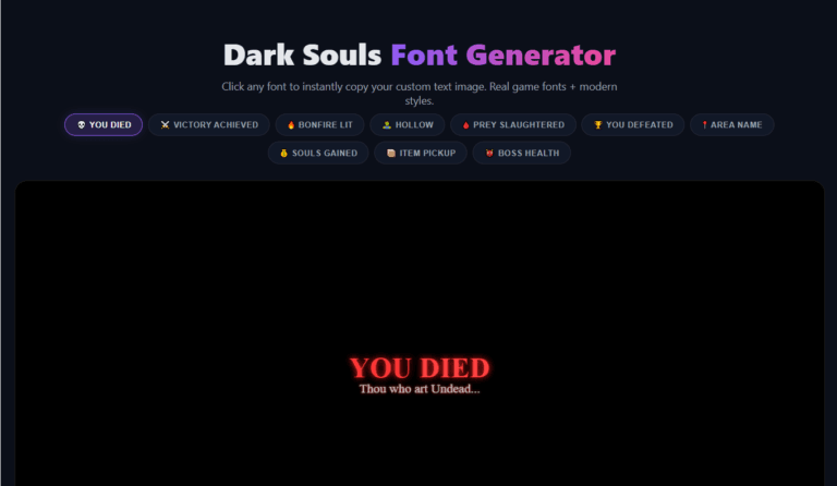
How to make it: Use the Dark Souls Font Generator. Select a dark fantasy background, set text color to blood red, add glow effect at 14-18px, and enable the “YOU DIED” preset. Download transparent PNG — overlay directly on your thumbnail screenshot.
2. Action & FPS Games
- Font: Bold, blocky, sans-serif
- Color: White with thick black outline, or solid color with high contrast
- Effect: Clean edges, no glow
- Text style: ALL CAPS, tight kerning
Example: Top FPS creators use Impact or Bebas Neue variants. Bold, direct, unapologetic.
How to make it: Use the GTA Font Generator. Select a game preset matching your thumbnail’s colour palette (GTA V for orange/black, Vice City for pink/blue). Download as transparent PNG.
3. RPG & Fantasy Games
- Font: Serif with gold accents, decorative but readable
- Color: Gold, white-gold, or bright yellow
- Effect: Subtle golden glow, drop shadow
- Text style: Title case for names, ALL CAPS for boss announcements
Example: “GREAT ENEMY FELLED” from Elden Ring — gold text, slightly glowing, dark background.
How to make it: Use the Elden Ring Font Generator. Select the “Golden” color preset, choose a dark fantasy background, and position text centrally.
4. Platformer & Indie Games
- Font: Pixel, blocky, retro
- Color: Bright, saturated colours
- Effect: No effects — crisp pixel edges
- Text style: ALL CAPS, or sentence case
Example: Pixel fonts read as “game-y” and retro. Perfect for Minecraft, Celeste, and indie game thumbnails.
How to make it: Use the Pixel Art Font Generator. Select transparent background, set text colour to bright white or neon, adjust shadow depth for 3D pop. Download PNG — paste directly over your thumbnail background.
The Golden Rule of Thumbnail Text
90% of your text should be on the LEFT side of the thumbnail.
Why? YouTube displays the video duration and channel icon in the bottom-right corner. Text placed there gets obscured. Left-justified text is immediately readable and creates natural eye flow toward the centre of the thumbnail.
5 Common Thumbnail Font Mistakes (And How to Fix Them)
| Mistake | Why It Fails | Fix |
|---|---|---|
| Thin fonts | Invisible at mobile thumbnail size | Use Bold, Extra Bold, or Black weights |
| Too many colours | Visual chaos — viewers can’t parse the message | Max 2 colours per text element |
| No outline on light backgrounds | Text blends into bright scenes | Add black outline or drop shadow |
| Decorative fonts as body text | Unreadable — decorative fonts are for headlines only | Use sans-serif for secondary text |
| Text too small | Unreadable at 120px width | Minimum 40pt for main text, 18pt for secondary |
Best Fonts by Use Case (Quick Reference)
| Use Case | Font Style | Recommended Size |
|---|---|---|
| Main headline | Bold sans-serif or serif | 48-72pt |
| Secondary text | Clean sans-serif | 20-30pt |
| Subtitle/context | Bold italic sans-serif | 16-22pt |
| Numbers (damage, countdown) | Monospace or bold sans-serif | 36-60pt |
| Decorative elements | Serif or pixel font | 18-28pt |
Optimal Color Combinations for Thumbnail Text
| Background | Best Text Colour | Outline |
|---|---|---|
| Dark (black, dark grey) | White, gold, bright red | Black |
| Light (white, light grey) | Black, dark red, dark blue | White |
| Vibrant (red, blue, green) | White, yellow | Dark or white depending on contrast |
| Complex (busy image) | White with thick black outline | Black |
| Transparent overlay | Any colour (matches your branding) | Black or white |
Pro tip: The Image Color Inverter can help you test how your thumbnail looks in inverted colours — if your text is still readable after inversion, your colour choices are solid.
Step-by-Step: Make a YouTube Thumbnail Font in 60 Seconds
- Open the relevant Ghostern font tool for your game:
- Horror/Dark → Dark Souls Font Generator
- RPG/Fantasy → Elden Ring Font Generator
- Action/FPS → GTA Font Generator
- Indie/Retro → Pixel Art Font Generator
- Type your headline text
- Set your desired colour and effect
- Click download PNG
- Drag the transparent PNG into your thumbnail editor
- Position on the left side of the frame
- Export as JPEG (YouTube prefers JPEG for thumbnails)
That’s it. No Photoshop, no 50-step tutorial, no paid fonts.
Quick Font Selection Checklist
| Check | Why It Matters |
|---|---|
| Is the font readable at 120px? | Mobile thumbnail views are the majority |
| Does it match the game’s aesthetic? | Viewer expectations = trust |
| Is there high contrast with background? | Low contrast = low CTR |
| Does it occupy the left side? | Right side gets obscured by YouTube UI |
| Are you using 2 fonts max? | More than 2 = visual chaos |
| Is it exportable as transparent PNG? | Transparency = overlay anywhere |
| Does it fit the emotional tone? | Horror vs action vs retro = different fonts |
Written by Sharjeel — Lead Developer & Founder of Ghostern, who built all four font tools referenced in this guide and tested their output across 200+ real YouTube thumbnails before publishing this breakdown. Read my full story →
Disclaimer: All tools referenced are independent fan projects and are not affiliated with FromSoftware, Rockstar Games, Mojang, Microsoft, or any game publisher. All game trademarks belong to their respective owners.
❓ Frequently Asked Questions
What is the best font for gaming YouTube thumbnails?
The best font depends on your game genre:
- Horror/Souls → Gothic (Dark Souls style)
- Action/FPS → Bold sans‑serif (GTA style)
- RPG/Fantasy → Gold serif (Elden Ring style)
- Indie/Retro → Pixel art font
All of these are available as transparent PNGs through the Ghostern font generators.
How do I add text to a YouTube thumbnail for free?
- Generate your text as a transparent PNG using any Ghostern font tool
- Download the PNG
- Open your thumbnail editor (Canva, GIMP, or any free image editor)
- Drag the PNG over your screenshot
- Position and resize as needed
- Export as JPEG
What font size should I use for YouTube thumbnails?
Main headline: 48-72pt, Secondary text: 20-30pt, Subtitle: 16-22pt. Test your thumbnail at mobile size (120px wide) before publishing.
Why should text be on the left side of thumbnails?
YouTube displays the video duration and channel icon in the bottom‑right corner. Text placed there gets obscured. Left‑aligned text is immediately readable and creates natural eye flow toward the centre.
Is white text on dark backgrounds always best?
White text on dark backgrounds is the most universally readable combo, but gold on dark works for fantasy games, and bright colours on pixel art backgrounds work for retro games. Always test contrast before publishing.
Can I use custom fonts for YouTube thumbnails without installing them?
Yes! Ghostern’s font generators output transparent PNGs of your styled text. You can add them to any thumbnail without installing fonts on your computer.
![A high-contrast video thumbnail for a 'Clan Tag Generator' tool, set against a futuristic, dark tech background. The text '[YOUR TAG HERE]' is prominently displayed in a sleek, glowing blue box, with a large orange arrow pointing to a box on the right listing example tags like '[GRUNT]', '[SNIPE]', and '[VIP]'. A small 'FREE!' badge is in the top-left corner, and a button below the examples reads 'INSTANT GENERATION'.](https://ghostern.com/wp-content/uploads/2026/07/Clan-Tag-Generator-Create-Unique-Tags-Instantly-768x429.png)