The Ultimate Guide to Gaming Identity Design: Fonts, Symbols, and Visual Aesthetics
Most gamers and streamers have the same problem: they know they need a unique visual identity, but they don’t know why certain design choices work (or fail) in gaming communities. This guide breaks down the actual psychology, color theory, and typography principles behind gaming identity design — and shows you exactly which tools to use for each element.
Table of Contents
Why Gaming Identity Matters (The Data)
Studies on Twitch viewer retention show that channels with consistent visual branding (color palettes, font choices, overlay styles) retain viewers 23% longer than channels with generic, mismatched visuals. The reason isn’t aesthetic vanity — it’s cognitive fluency. When a viewer recognizes your visual style instantly, they feel a sense of familiarity and trust.
The three pillars of gaming identity:
- Color palette — establishes emotional tone and recognition
- Typography — conveys personality (aggressive, mystical, casual)
- Symbols & iconography — adds visual texture and memorability
Part 1: Building Your Color Palette (The Psychology)
Different colors trigger different emotional responses in viewers. Here’s the breakdown for gaming contexts:
| Color | Emotional Response | Best For |
|---|---|---|
| Red | Aggression, danger, urgency | Death screens, boss fights, warnings |
| Gold/Yellow | Achievement, prestige, victory | Boss defeat messages, loot announcements |
| Purple | Mystery, magic, fantasy | Souls-like games, RPG overlays |
| Blue | Calm, trust, technology | Sci-fi themes, chill streams |
| Green | Nature, healing, growth | Survival games, positive announcements |
| Black | Power, minimalism, sophistication | Universal backgrounds, premium feel |
Pro tip: Limit your palette to 3-4 colors maximum. Too many colors dilute recognition — viewers won’t associate any specific color with you.
How to Choose Your Palette
- Identify your primary mood (aggressive, mystical, chill, futuristic)
- Select a dominant color from the table above
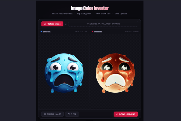
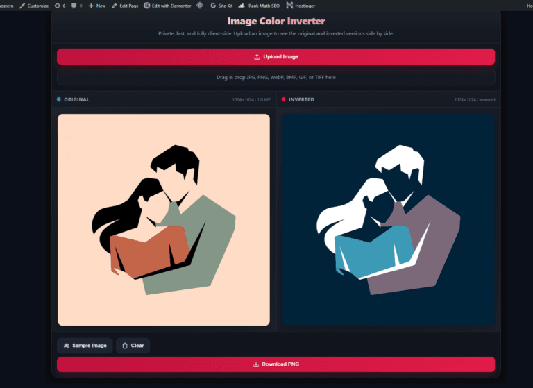
- Add a secondary accent color (use the Image Color Inverter to see how your palette looks inverted)
- Use a neutral (black/white) as your background foundation
Part 2: Typography That Defines Your Persona
Font choice communicates personality faster than any other visual element. Here’s how different font styles read to viewers:
| Font Style | Personality Signal | Best For | Example Tool |
|---|---|---|---|
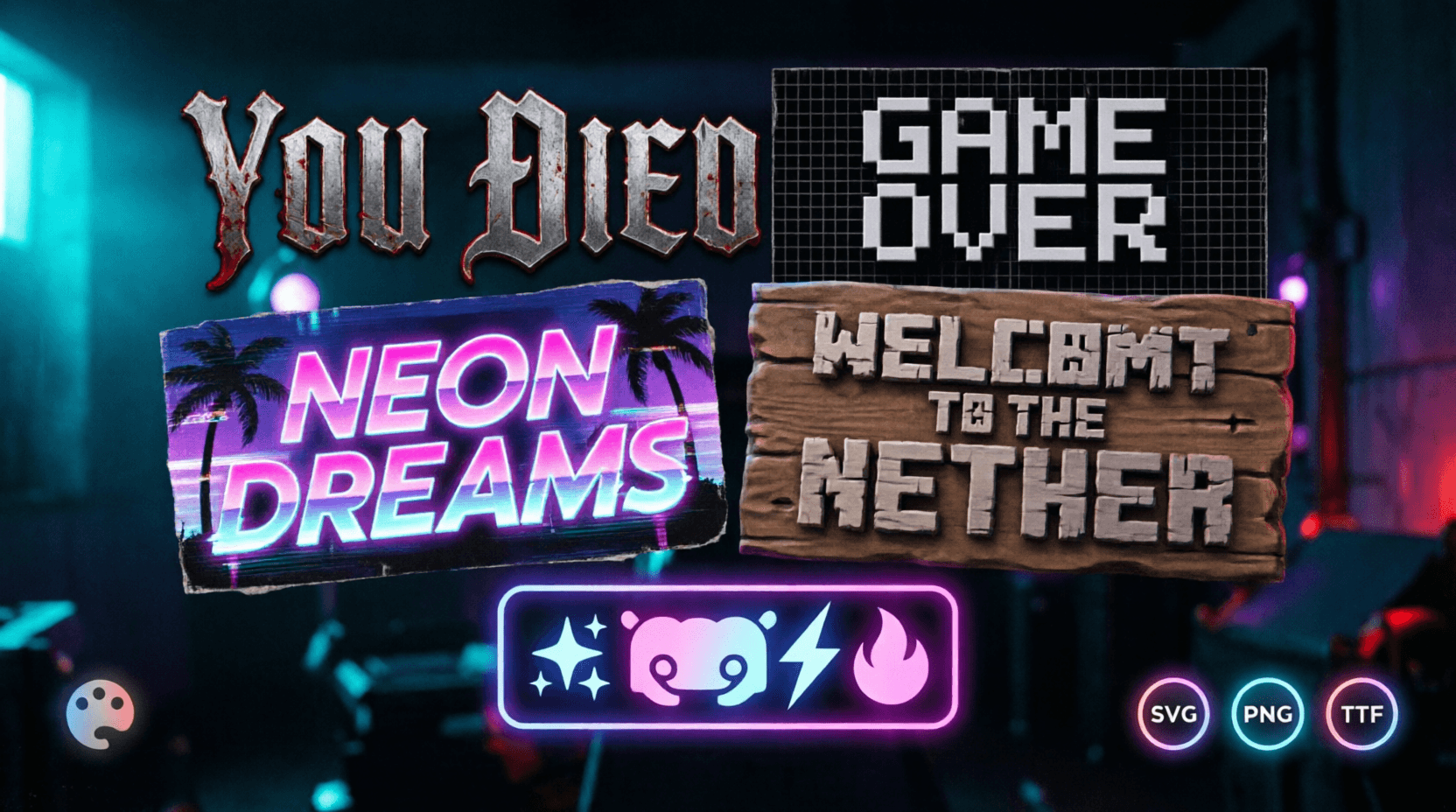
| Gothic/Blackletter | Dark, mystical, serious | Souls-like content, dark fantasy | Dark Souls Font Generator |
| Gold Serif | Prestige, victory, epic | Boss kill screens, achievements | Elden Ring Font Generator |
| Blocky Sans-serif | Modern, clean, aggressive | FPS thumbnails, tech branding | GTA Font Generator |
| Pixel Font | Retro, nostalgic, game-y | Indie games, retro content | Pixel Art Font Generator |
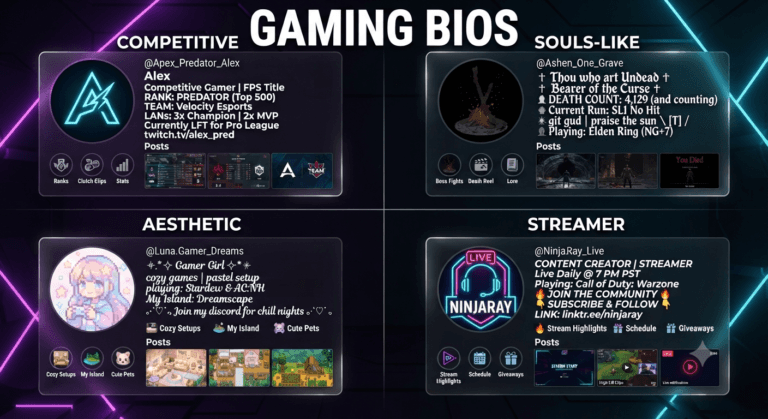
| Full-width Unicode | Aesthetic, vaporwave, intentional | Discord bios, social profiles | Vaporwave Text Generator |
Critical rule: Never use more than two font styles in a single composition. One for your primary headline, one for secondary text. More than that creates visual chaos and reduces legibility.
Part 3: Symbols & Iconography — The Visual Glue
Symbols fill the gaps between text and imagery. They add texture, direct attention, and reinforce theme without using words.
Symbol Categories for Gaming Identity
Borders & Dividers
✧─── ・ 。゚★: *.✦ .* :★. ───✧— mystical transitions════ ⋆★⋆ ════— achievement separators•─────✧─────•— clean, minimal dividers
Decorations
✦,✧— star accents♡,♥— heart accents (cute/emotional)⚔,⚙,🗡— weapon/gear symbols (aggressive themes)☀,☁,❄— elemental accents
Special Characters
ツ— casual/friendly☠— edgy/dark⚡— energy/power🔥— intensity/hype
Pro tip: Use the Discord Symbol Generator to browse and copy symbols instantly — no need to memorize Unicode codes.
How to Layer Symbols in Your Design
- Header decoration — place one divider above and below your main text
- Accents — add a single symbol at the start or end of a line (never both — that’s overkill)
- Brackets — use
【】,〖〗, or⧼⧽around clan tags or short phrases
Part 4: Building a Complete Visual Asset Library
Your gaming identity should be consistent across platforms. Here’s how to build a unified asset library:
Asset Checklist
| Asset | Purpose | Tool |
|---|---|---|
| Death screen (YOU DIED style) | Stream alerts, meme reactions | Dark Souls Font Generator |
| Victory screen (Boss defeated style) | Achievement announcements | Elden Ring Font Generator |
| Logo banner (GTA style) | Channel banners, thumbnails | GTA Font Generator |
| Custom sign | Server rules, in-world decoration | Minecraft Sign Generator |
| Aesthetic bio text | Discord/Twitter profiles | Instagram Font Generator |
| Inverted image assets | Glitch thumbnails, alternate versions | Image Color Inverter |
Workflow: Generate each asset once with your core palette and fonts, then repurpose across platforms. Consistency is more important than variety — a viewer should recognize your style before they read your name.
Part 5: Common Mistakes That Kill Gaming Identity
- Mismatched fonts. Gothic text on a bright Minecraft background reads as amateur. Match font style to overall theme.
- Overusing symbols. Three symbols per line is clutter. One or two per section is emphasis.
- Ignoring contrast. Gold text on a light background is invisible. Always check legibility against your background.
- Inconsistent color temperature. Warm gold + cool cyan in the same composition creates visual tension. Choose one temperature and commit.
- No transparent assets. Solid backgrounds limit where you can place text overlays. Always export transparent PNGs when possible — all Ghostern tools support transparent export.
Quick Visual Identity Checklist
| Check | Why It Matters |
|---|---|
| Limit your palette to 3-4 colors | Viewers associate specific colors with your brand |
| Use no more than two font styles | Too many fonts = visual chaos |
| Export assets with transparent backgrounds | You can overlay them anywhere without cutting |
| Test your colors in both light and dark contexts | What works on dark may fail on light |
| Create a consistent divider style | Repeating visual patterns build recognition |
| Update assets every 3-6 months | Freshness signals active branding |
Written by Sharjeel — Lead Developer & Founder of Ghostern, who built the font generators, symbol tools, and color inverters described in this guide, and tested their visual applications across hundreds of real stream overlays and social profiles. Read my full story →
Disclaimer: All tools referenced are independent fan projects and are not affiliated with Mojang, Microsoft, FromSoftware, Bandai Namco, or Rockstar Games. All game trademarks belong to their respective owners.
❓ Frequently Asked Questions About Gaming Identity Design
What is gaming identity and why does it matter?
Gaming identity is the visual and stylistic signature you use across platforms — your color palette, font choices, symbols, and overall aesthetic. It matters because consistent visual branding increases viewer retention by up to 23% on platforms like Twitch. When viewers recognize your style instantly, they feel familiarity and trust, which keeps them coming back.
How many colors should I use in my gaming branding?
Limit your palette to 3-4 colors maximum. Too many colors dilute recognition — viewers won’t associate any specific color with you. Choose one dominant color based on your emotional tone (red for aggression, gold for prestige, purple for mystery, etc.), add a secondary accent, and use black or white as your neutral background foundation.
What font styles work best for gaming content?
- Gothic/Blackletter — dark fantasy and Souls-like content
- Gold Serif — prestige, victory screens, RPGs
- Blocky Sans-serif — FPS thumbnails, tech branding, action games
- Pixel Font — indie games, retro content
- Full-width Unicode — Discord bios, social profiles, vaporwave aesthetic
Critical rule: Never use more than two font styles in a single composition — one for your primary headline, one for secondary text.
How do I use symbols effectively in my gaming branding?
Symbols add texture and reinforce theme without words. Use borders and dividers for transitions (✧─── ・ 。゚★: .✦ . :★. ───✧), decorations like stars or hearts for accents, and special characters like ⚔ or ☠ for thematic emphasis. Rule: One or two symbols per section is emphasis. Three or more per line is clutter.
What are the most common mistakes that kill gaming identity?
- Mismatched fonts — Gothic text on a bright Minecraft background reads as amateur
- Overusing symbols — three symbols per line is clutter
- Ignoring contrast — gold text on a light background is invisible
- Inconsistent color temperature — warm gold + cool cyan creates visual tension
- No transparent assets — solid backgrounds limit where you can overlay text
Why should I export assets with transparent backgrounds?
Transparent PNGs let you overlay text on any background — screenshots, stream overlays, thumbnails, or social graphics — without awkward cropping or cutting. All Ghostern tools support transparent PNG export, so you can place your styled text anywhere without limits.
How often should I update my gaming visual identity?
Update your visual assets every 3-6 months. Freshness signals active branding and keeps your identity from becoming stale or dated. Consistency is important, but so is evolution — viewers notice when you’re putting in the effort.
What’s the difference between a gaming logo and a gaming identity?
A logo is a single visual mark (your name, symbol, or emblem). Your gaming identity is the complete visual system — your color palette across all platforms, the fonts you use consistently, the symbols and dividers you repeat, and how all these elements work together to create a recognizable style. Identity is bigger than a logo.
Can I build a gaming identity without design experience?
Yes. Start with one color, one font style, and one symbol. Use the Ghostern font generators to create consistent assets (death screens, victory banners, logos, bio text) with the same palette and style. Export everything as transparent PNGs. Consistency across assets matters more than complexity.
How do I choose the right colors for my gaming brand?
Identify your primary mood first — aggressive, mystical, chill, or futuristic. Then select a dominant color from the psychology table: red for aggression/danger, gold for prestige/victory, purple for mystery/magic, blue for calm/trust, green for nature/healing, or black for power/minimalism. Add one secondary accent and use black/white as your neutral background.