A great wallpaper is not just a pretty image. It is the first thing you see every time you unlock your phone, open your desktop, or check your lock screen. That means color matters more than most people think. The right palette can make a screen feel calm, clean, dramatic, futuristic, or deeply personal.
Table of Contents
For Ghostern’s audience, this is especially important. Aesthetic wallpaper color theory is not just for designers. It is for gamers who want their setup to feel sharper, anime fans who want their phone to carry a certain mood, and Gen Z users who want every screen to match their identity.
A wallpaper should not fight your icons, widgets, or text. It should support them. That is where color theory comes in.
Why color theory matters for wallpapers
Color is the fastest way to create mood.
A dark purple wallpaper can feel mysterious and premium.
A soft blue wallpaper can feel calm and clean.
A neon pink and cyan palette can feel energetic and futuristic.
A muted black-and-gray background can make a setup feel focused and powerful.
When a wallpaper uses color well, it does more than decorate a screen. It creates an atmosphere.
That is why Ghostern’s visual culture works so well across different pages like:
These pages all depend on visual mood, and color is what ties everything together.
The best wallpaper palettes start with a feeling
Before choosing a color palette, decide what kind of feeling you want your screen to give off.
Some of the strongest directions for Ghostern’s audience are:
Dark fantasy mood
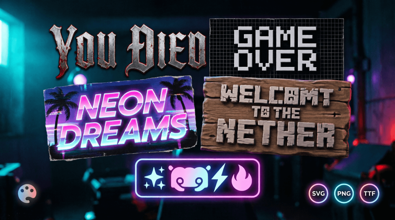
Deep blacks, muted reds, smoky purples, steel grays, and glowing highlights work well for this style. It fits gaming pages like Dark Souls Font and Elden Ring Font.
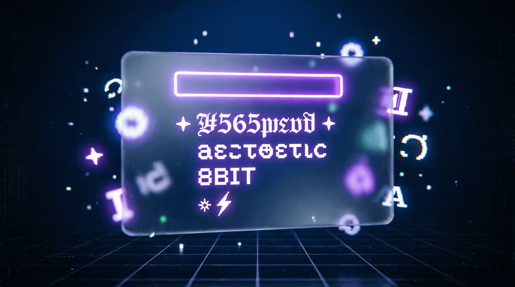
Neon cyberpunk
Purple, cyan, electric blue, and magenta can make a wallpaper feel fast, futuristic, and high-energy. This works well for setup pages and aesthetic visuals.
Anime calm
Soft pinks, pastel blues, warm neutrals, and clean white space create a smoother, more emotional screen. This is perfect for users who want anime wallpapers but still want a balanced layout.
Minimal clean
Black, charcoal, off-white, gray, and one accent color keep the screen simple and premium. This is the easiest style to use when you want your icons and widgets to stay readable.
Vaporwave retro
Purple, pink, cyan, and faded sunset colors can create a nostalgic digital feel. That makes this palette ideal for pages like Vaporwave Text Generator.
The role of contrast
Color theory is not only about choosing nice colors. It is also about contrast.
Contrast is what helps a wallpaper stay usable on a phone or desktop. If everything is too bright, the icons disappear. If everything is too dark, the wallpaper can feel flat. If the tones clash too much, the screen becomes noisy.
Good wallpapers usually balance:
- light and dark areas
- soft and strong colors
- warm and cool tones
- busy and empty space
A clean wallpaper gives your icons room to breathe. That is especially important on home screens where readability matters.
If your style is more visual and detailed, you can still keep the design controlled by using the right balance of brightness and empty space.
Light and shadow make wallpaper colors feel alive
Color alone does not create the full effect. Light and shadow change how color feels.
A glowing purple edge on a dark background feels different from the same purple used on a flat pastel screen. A soft light source can make anime art feel dreamy. A sharp glow can make a gaming wallpaper feel powerful. A shadow-heavy image can create tension and drama.
This is why wallpapers with a clear visual source often feel stronger than random colorful images. They feel intentional.
For Ghostern-style visuals, the best wallpapers usually have one of these light directions:
- dark with glow
- soft with blur
- cinematic with contrast
- minimal with gentle gradients
That is the kind of structure that helps a screen feel polished instead of cluttered.
Texture adds depth without ruining the layout
Texture is one of the easiest ways to make a wallpaper feel more premium.
A flat wallpaper can look clean, but it can also feel too simple if there is no depth. Texture solves that problem. It can come from:
- soft grain
- blurred lighting
- fabric-like shading
- cloudy gradients
- subtle noise
- cinematic glow
The trick is not to overdo it. A wallpaper should have enough texture to feel alive, but not so much that it distracts from app icons or widgets.
This matters a lot for home screens because the wallpaper has to work with the phone, not against it.
How to choose a wallpaper palette that works
A good palette usually has three parts:
- a base color
- a support color
- an accent color
For Ghostern, one of the strongest palette directions is:
- Background: deep black or charcoal
- Base tone: purple or blue
- Accent: cyan or magenta
That palette fits the brand well because it feels:
- dark mode friendly
- gaming-oriented
- anime compatible
- futuristic without being too loud
You can also shift the mood depending on the page:
- use darker purples for fantasy gaming
- use softer blues for anime calm
- use pink and cyan for vaporwave energy
- use grayscale with one bright accent for minimal setups
This is why a wallpaper should never be chosen in isolation. It should match the rest of the device.
Match the wallpaper to your device style
A wallpaper becomes much stronger when it matches your home screen and setup.
If your wallpaper is anime-inspired, your icons and profile style should not feel completely disconnected. If your wallpaper is dark fantasy, your app layout and widgets should feel clean and focused. If your desktop has a neon gaming look, your phone can echo the same palette so the whole digital space feels connected.
That is the full Ghostern idea:
your device should feel like part of your identity.
Pages like these help reinforce that:
What makes a wallpaper feel “viral”
A wallpaper does not go viral just because it looks nice. It usually spreads because it hits a strong emotional or visual sweet spot.
The most shareable wallpapers often have:
- a clear mood
- a simple but memorable palette
- strong contrast
- enough empty space for a home screen
- a style that feels current
That is why neon purple, dark mode, cyberpunk, and anime-core visuals perform so well. They are expressive, readable, and easy to adapt to different devices.
But viral does not always mean loud. Sometimes the most shareable wallpapers are the ones that feel the most balanced.
Turning color theory into your own wallpaper
If you want to create your own wallpaper, start with the mood first, then build the palette around it.
A simple workflow looks like this:
- choose one visual theme
- pick 2–4 colors that fit the mood
- keep the background simple enough for icons
- add light or glow to create depth
- make sure the image works on both mobile and desktop
For Ghostern’s ecosystem, you can mix wallpaper work with typography and aesthetic tools too:
That combination makes the whole screen feel more intentional.
Best wallpaper color directions for Ghostern
If you are building around the Ghostern brand, these palette directions make the most sense:
Neon purple glow
This is the strongest brand fit. It feels modern, dark, and premium.
Cyan + magenta
Great for cyberpunk, vaporwave, and digital energy.
Black + gray + one accent color
Perfect for minimal gaming desktops and clean phone themes.
Dark blue + soft purple
Good for calm anime wallpapers and sleek device layouts.
Red glow on dark background
Best for intense gaming moods and dramatic fantasy visuals.
Each of these palettes can work across Desktop Wallpapers and Mobile Wallpapers if the composition is balanced well.
Final thought
Aesthetic wallpaper color theory is really about control. When you understand how colors behave together, you can build screens that feel more personal, more readable, and more beautiful.
For Ghostern, that means every wallpaper should do more than look good. It should fit the bigger world of gaming, anime, fonts, symbols, setups, and device customization. That is what makes a screen feel like yours.
A wallpaper is not just a background. It is part of your digital identity.