A home screen can feel calm or chaotic in just one glance. If the wallpaper is too busy, the icons start to look messy. If the colors clash, the whole phone feels off. But when the wallpaper is simple, balanced, and matched to your setup, the screen suddenly feels cleaner and more personal.
That is why a clean minimal home screen wallpaper matters so much for Ghostern’s audience. For gamers, anime fans, and Gen Z users who care about digital style, the phone is part of the vibe. It should feel like it belongs to you, not like a default layout copied from everyone else.
A minimal home screen is not about making your device boring. It is about making it feel intentional.
Why clean screens feel better
A cluttered screen creates visual noise. Every icon, widget, and color competes for attention. That makes the phone feel heavier and less enjoyable to use.
A clean screen works better because it:
- reduces visual distraction
- makes icons easier to scan
- gives widgets space to breathe
- creates a calmer daily experience
- makes your device feel more premium
For Ghostern’s style, that means your wallpaper should support your identity instead of fighting it. If you like dark fantasy, your wallpaper should leave room for icons and widgets. If you like anime, your wallpaper should still feel organized enough to keep the screen readable. If you like gaming setups, your home screen should feel like part of the same visual system.
Start with the wallpaper, not the icons
Most people customize icons first and forget that the wallpaper is the foundation. The wallpaper controls the mood before anything else.
A clean minimal wallpaper can support:
- dark mode setups
- anime-inspired phones
- gaming loadout themes
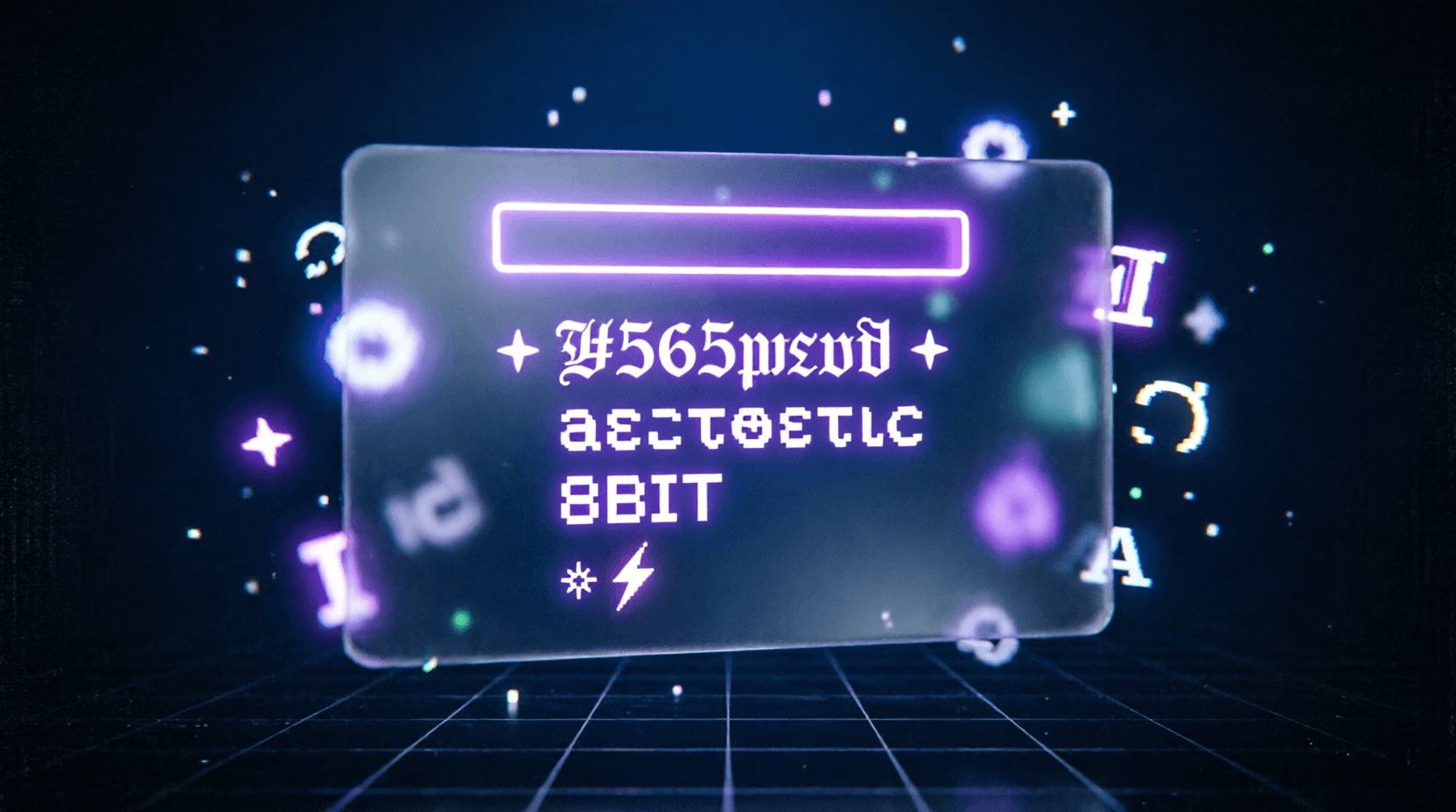
- neon purple styling
- soft aesthetic layouts
If you want a stronger identity, you can pair your wallpaper with related Ghostern pages like:
That way the wallpaper is not just pretty. It becomes part of a full customization system.
Match your wallpaper to your icons
The best home screen layouts feel balanced because the wallpaper and icons work together.
A few simple rules help a lot:
If your wallpaper is dark, keep icons light or clearly outlined.
If your wallpaper is colorful, use a more neutral icon style.
If your wallpaper is soft and minimal, avoid overly bright icon packs.
If your wallpaper already has strong focus points, leave those areas free from icons.
You do not need exact color matching. You need color harmony.
That is why Ghostern’s audience usually does better with:
- dark fantasy wallpapers
- neon gaming visuals
- soft anime screens
- muted gradients
- clean aesthetic backgrounds
These styles make it easier to keep the screen readable while still looking good.
Avoid these wallpaper mistakes
Some wallpapers look good in a preview but fail on the actual home screen.
Avoid:
- busy backgrounds with too many details
- bright centers where app icons sit
- high-contrast chaos behind widgets
- wallpapers that compete with the clock or dock
- mixed styles that do not fit the rest of the device
A phone wallpaper should not fight your layout. It should frame it.
That is why minimal design is so effective. It gives your home screen structure.
Use negative space on purpose
Negative space is one of the best tools for a clean screen. It is the empty area that gives your icons and widgets room to breathe.
Good wallpapers often leave space where:
- the clock sits
- notifications appear
- widgets are placed
- the dock appears at the bottom
- your most-used apps sit
This is especially useful on phones with larger displays, because clutter becomes more noticeable on big screens.
If you want a more polished setup, look for wallpapers with:
- subtle gradients
- dark corners
- soft blur
- simple skies
- empty center areas
- smooth color transitions
Those details make the home screen feel more intentional.
Choose the wallpaper around your widgets
Widgets matter more than most people think. A wallpaper that looks nice behind a lock screen may not work well once widgets are added.
Before choosing a wallpaper, think about:
- where your clock goes
- whether you use weather widgets
- whether your calendar sits near the top
- whether your dock is visible
- whether you use stacked widgets
If your widgets are bold, keep the background softer.
If your widgets are simple, the wallpaper can carry a little more style.
This is why a lot of Ghostern-style customization works best when the wallpaper and widget layout are planned together. A clean home screen is a composition, not just a background.
Clean minimal does not have to mean plain
A lot of people think minimal means empty. It does not.
Minimal can still feel:
- anime-inspired
- gaming-focused
- futuristic
- cozy
- dark
- elegant
- emotional
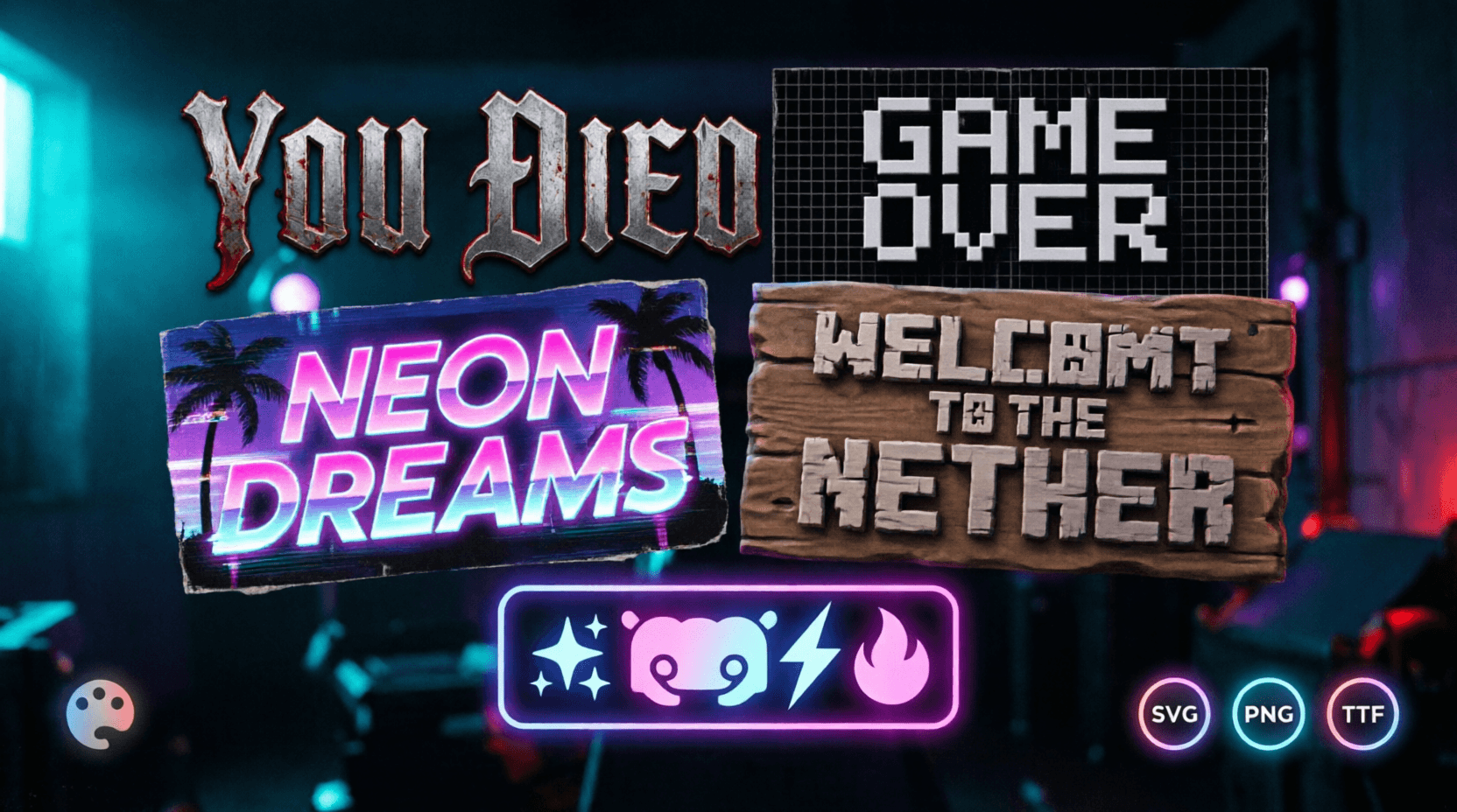
For example, a dark Souls-style wallpaper can still feel minimal if the composition is controlled. A clean anime wallpaper can still have personality if the colors are soft and the scene is balanced. A vaporwave-style phone can still feel simple if the background is not overloaded.
If you want to explore styles that fit this mood, these Ghostern pages are useful:
Good wallpaper choices for a balanced home screen
Some wallpaper types work especially well for minimal setups.
1. Soft gradients
These are ideal when you want the screen to feel smooth and calm. Gradients help create visual flow without distraction.
2. Dark fantasy scenes
Good for gamers who want mood without clutter. Dark Souls and Elden Ring-inspired visuals work well here.
3. Anime portraits with space around them
A wallpaper with one clear subject and a simple background can feel expressive without becoming messy.
4. Clean aesthetic lighting
Soft glows, neon edges, and blurred shapes can create a modern digital vibe.
5. Simple texture backgrounds
These work well if you want the wallpaper to support app icons instead of competing with them.
For that kind of style, you can look at:
Why Ghostern fits this topic so well
This topic is not just about wallpaper design. It is about the full digital identity that Ghostern is building.
A clean home screen is part of:
- your phone aesthetic
- your gaming vibe
- your anime preference
- your profile style
- your overall setup mood
That is why Ghostern pages like these matter together:
The homepage, hubs, and tools all work together to support the same idea: make your digital world feel like yours.
How to build a cleaner home screen
If you want a more balanced screen, use this approach:
- Pick one main vibe.
Dark gaming, anime, vaporwave, clean minimal, or mixed aesthetic. - Choose a wallpaper that leaves breathing room.
Do not pick a background that fights your icons. - Keep the icon style consistent.
Use matching colors or similar icon shapes. - Place widgets carefully.
Make the wallpaper support the widget layout. - Keep the dock area calm.
The bottom of the screen should not feel crowded. - Match the wallpaper to the rest of the device.
If your phone has an anime wallpaper, let your Discord symbols, gamer text, or setup pages reflect that same mood.
Final thought
A clean minimal home screen wallpaper is not just about looking nice. It is about making your phone feel organized, calm, and personal.
For Ghostern’s audience, that means your wallpaper should fit your gaming identity, your anime taste, and your overall device aesthetic. When the screen is balanced, the phone feels better to use. It feels more like a sanctuary and less like a pile of apps.
That is the real value of minimal customization.
Not empty.
Not boring.
Just intentional.